7 Website Navigation Examples Worth Studying in 2026
Curated website navigation examples with pattern analysis, accessibility guidance, and actionable takeaways for blogs and business sites alike.
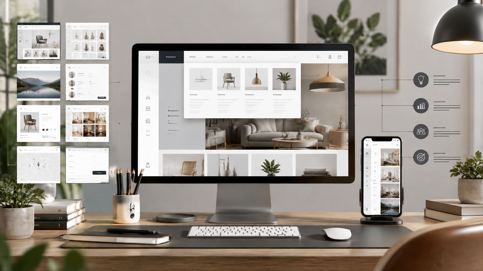
Most lists of the best navigation design showcase portfolio and brand sites with menus that would collapse under a real blog archive. A full screen overlay looks striking with five pages. It's a liability when readers need categories, search, older posts, and a way back home from a deep linked article. That's why I don't recommend copying screenshots. Study the pattern, then test it against your content depth, your mobile layout, and your keyboard users.
These seven sources of website navigation examples are worth studying for different reasons. Some give you visual range, some give you research, and one gives you the accessibility rules the galleries skip. For each one, I'll show what pattern it demonstrates, when it fits, what to avoid, and what you can replicate on a WordPress site without a redesign.
1. Webflow Creative Website Menu Ideas
Start with Webflow's menu examples article if you want range fast. It walks through 10 named website examples and explains the specific menu choice on each one, rather than dropping screenshots without commentary. You'll see dropdowns, mega menus, and stripped back minimal navigation side by side, with links out to the live sites so you can test hover, click, and mobile behavior yourself.
That range is the value and the trap. Several examples come from visually ambitious brand and portfolio sites, not content driven blogs. A dramatic animated menu earns its keep when the site sells design services. On a publication, it competes with the article, and readers won't wait around. Research summarized by Nielsen Norman Group on whether navigation is useful found users often ignored navigation regions during their initial page scan and could leave within roughly 2 to 3 seconds when a page did not seem relevant.
What to replicate
- Steal the labeling, not the animation: Notice which examples use plain, recognizable words for top level items.
- Check the mega menu logic: Only sites with broad categories justify one.
- Test on your phone: If the pattern needs a large screen to make sense, skip it.
Borrow the clearest top nav structure you find here, keep your labels boring, and let your headlines do the visual work.
2. Framer Website Navigation Design Examples
Framer's navigation guide pairs nine navigation patterns with a live example for each, then does what most galleries don't. It talks about trade offs. You'll get notes on keyboard support, focus states, and contrast alongside desktop and mobile behavior, written in language a nontechnical site owner can act on.
That mobile discussion matters more than the screenshots. Industry coverage of benchmark reporting cited by Lovable's navigation best practices guide indicates 67% of mobile e-commerce sites had mediocre or poor navigation performance, compared with 58% on desktop. Hiding everything behind a hamburger icon is the usual cause. Readers can't choose a category they can't see, and they won't open a menu on every page just to check what's inside.
If your mobile menu hides your best categories, it isn't minimal. It's just hidden.
Some Framer examples are one page or design led sites, so they won't map cleanly onto a growing blog with archives. Treat it as a comparison guide, not a research database. If you're working through the mobile side specifically, our guide on how to make a WordPress blog mobile friendly covers the layout checks to run alongside it.
Replicate this. Keep two or three priority links visible on mobile, put the rest in the menu, and confirm every item is reachable by keyboard with a visible focus outline.
3. W3C Web Accessibility Initiative Navigation Design
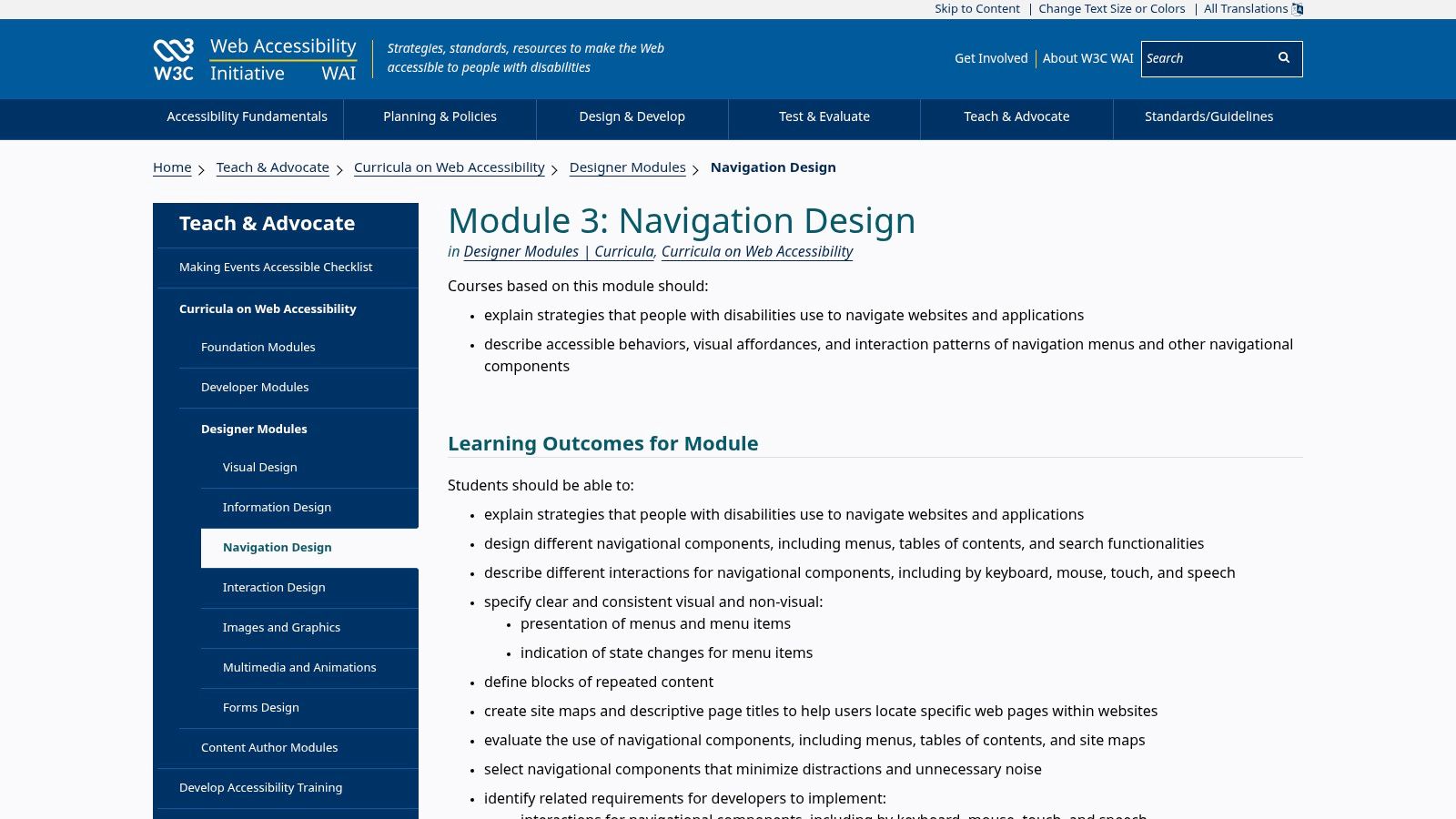
This one won't win a beauty contest, and that's exactly why it's on the list. The W3C Web Accessibility Initiative navigation design module is a free learning resource with stated learning outcomes and exercises. It covers menus, breadcrumbs, site maps, and search as one system, plus descriptive page titles, current page indicators, tables of contents, and skip links.
The gap it fills is large. The 2025 WebAIM Million analysis reported by Be Accessible's accessibility statistics roundup found detectable WCAG failures on 94.8% of the top one million homepages, with low contrast text on 79.1% of pages. That same analysis found pages using ARIA averaged twice as many errors as pages without it, which is a useful warning. Slapping ARIA attributes on a broken menu doesn't fix it. Semantic HTML and sensible heading order do most of the work.
Run this checklist on your own menu
- Tab through it: Can you reach and open every item without a mouse?
- Press Escape: Does an open submenu close and return focus sensibly?
- Look for your location: Does the current page or section show a clear state?
- Zoom to 200%: Does the menu still work, or does it overflow and vanish?
Replicate the discipline, not a visual style. Add a skip link, label your landmarks, and mark the current page. Those three changes cost an afternoon in most WordPress themes.
4. Baymard Institute Homepage and Category Navigation Examples
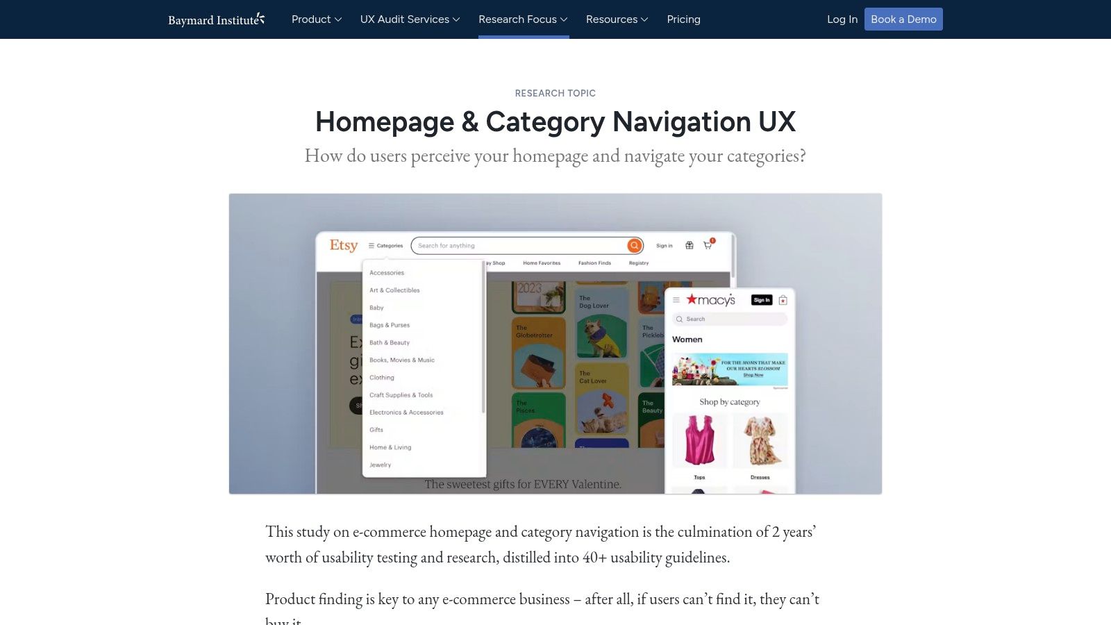
Use Baymard's homepage and category research when your problem is volume. It's a library of thousands of categorized, annotated examples across homepage, dropdown, top level, and category page patterns, on desktop and mobile. The annotations come from usability research, so you're comparing tested behavior instead of taste. Some examples and articles are free. Full research access is paid.
The e-commerce focus is the obvious limit, but the underlying problem transfers. A store with deep product categories and a blog with deep archives both fail the same way. Readers get buried. The numbers behind fixing that are not subtle. A comparative study of 5,000 user sessions published in the International Academic Journal of Innovative Research reported task completion rising from 68% to 91% with a behavior informed navigation structure, while average clicks to the goal fell from 7.1 to 4.3.
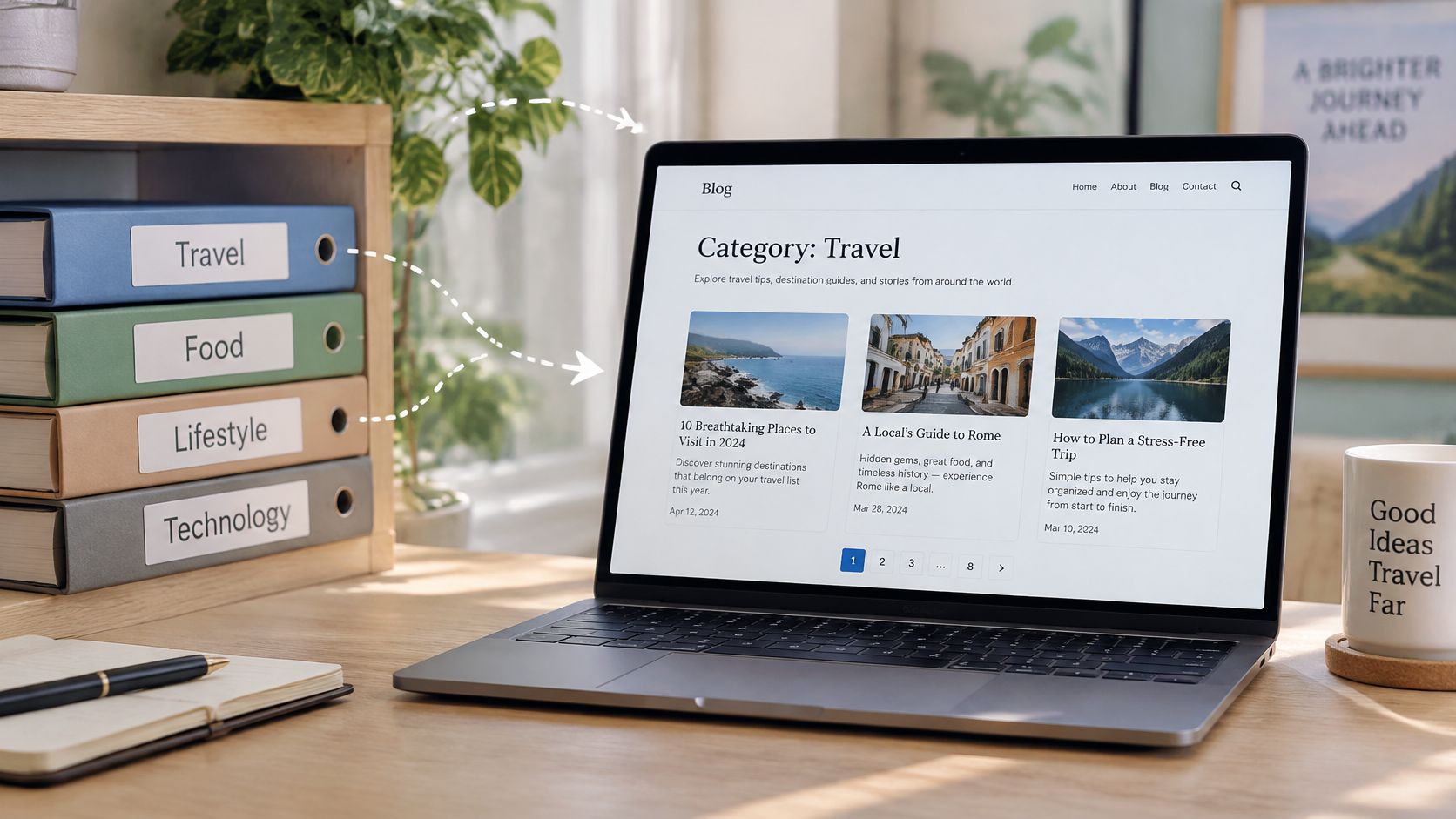
Baymard's category patterns pair well with a tidy archive structure, and our walkthrough of the WordPress post category page shows how to set those landing pages up properly.
Replicate the shallow hierarchy. If a reader needs four clicks to reach a topic, flatten it, rename the category in their words, and add search beside the menu for people who already know what they want.
5. Nielsen Norman Group Website Navigation and Information Architecture
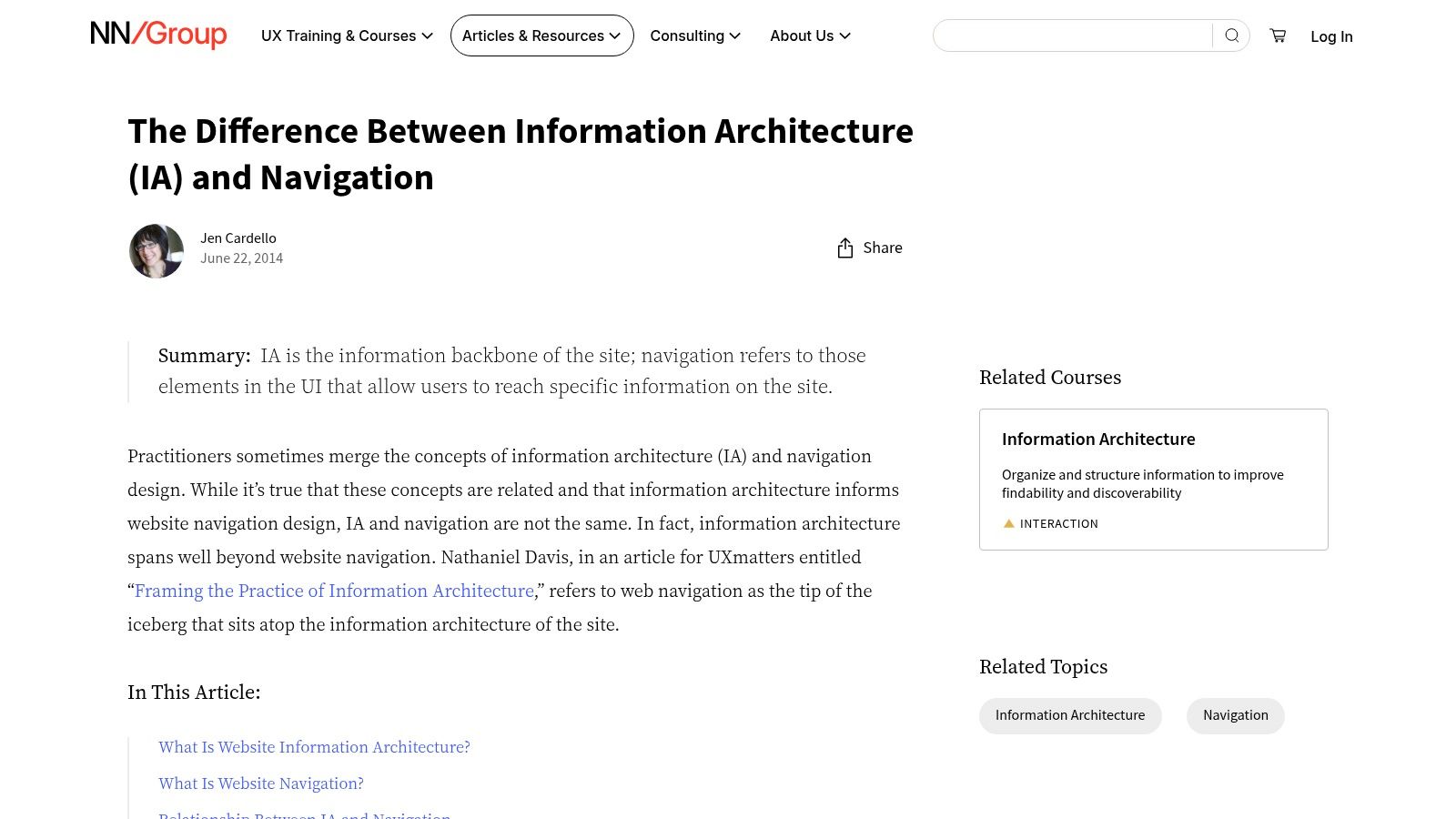
Before you pick a menu pattern, read Nielsen Norman Group on information architecture versus navigation. The distinction sounds academic until your menu breaks. Information architecture is how your content is organized. Navigation is just the visible layer on top of it. A beautiful menu over a messy category structure still strands readers.
The article separates global and local navigation, breadcrumbs, related links, and footers, and explains how content depth should drive menu choices. That framing stops a common beginner mistake, which is treating the header as the entire navigation system. On a publication, related post links and breadcrumbs often move readers further than the top menu ever will, because they appear at the moment of interest.
Practical rule: Fix your categories first. A menu can only expose structure that already exists.
It's more conceptual than a screenshot gallery, and some Nielsen Norman Group material sits behind paid access. I still rank it essential for anyone planning categories and archives. WordPress users will get more from it after reading our explainer on custom post types and taxonomies, since taxonomy decisions are information architecture decisions.
Replicate the audit. List your content groups, count the depth, and only then decide whether you need a simple top nav, dropdowns, or something bigger.
6. Regards Design Website Navigation Examples
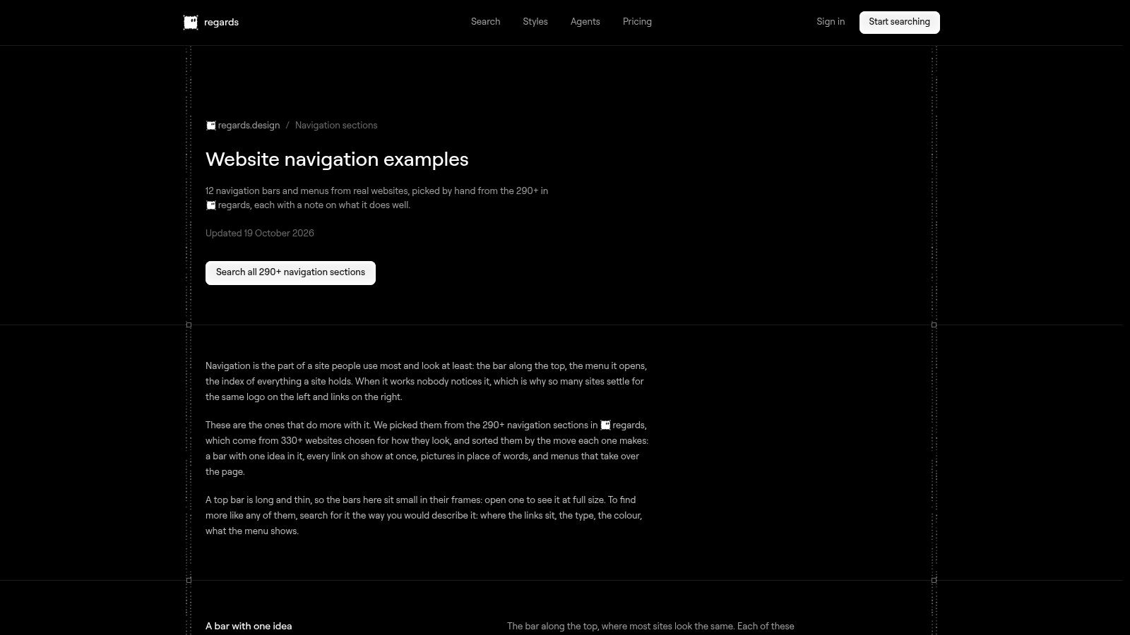
Regards Design's navigation sections collection is the purest inspiration source here. It's a searchable, curated set of navigation bars and menus from real websites, grouped by design approach, with short notes on what each example does well. Because it focuses only on navigation rather than whole page design, you can compare header layouts quickly without getting distracted by hero imagery.
Browse it with a specific question or you'll waste an hour. Decide in advance whether you're looking at logo placement, the position of a search icon, how many top level items sites carry, or how a menu handles a call to action button. Screenshot three candidates, then check each against your actual category list.
Where this source stops helping
- No usability evidence: Notes describe intent, not tested outcomes.
- No accessibility detail: You can't judge focus states or screen reader behavior from a screenshot.
- Complexity creep: Several showcased patterns are heavier than a straightforward blog needs.
That's not a reason to skip it. It's a reason to pair it with the W3C module above. Use Regards Design to shortlist a look, then use the accessibility checklist to decide whether that look survives contact with a keyboard.
Replicate one header layout you like, then strip it back. Remove icons that don't clarify a label, cut any top level item you can't justify, and keep the search entry point visible.
7. HubSpot Website Navigation Examples and Best Practices
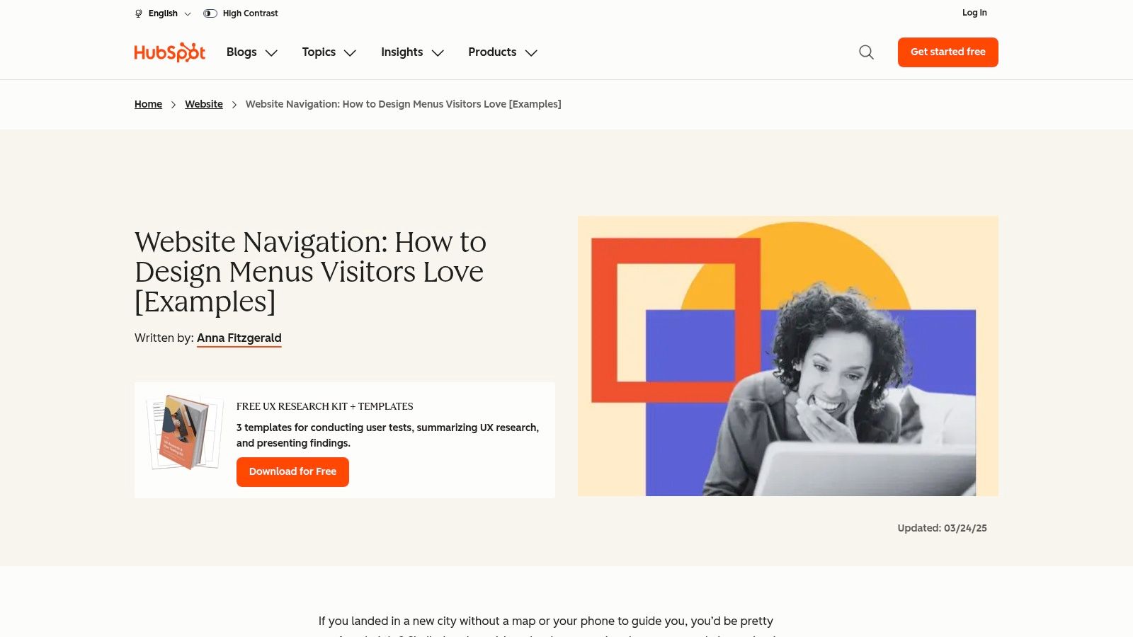
HubSpot's navigation examples guide is the most approachable entry point for a small business owner. It illustrates patterns with named business websites, covering category menus, dropdowns, persona based choices, sidebars, and large footer menus, plus practical notes on consistency, mobile layouts, and the performance cost of image heavy navigation.
The persona based pattern deserves skepticism. Asking visitors to self identify before they can browse works for a company selling to distinct buyer types. On a blog it usually adds a click and solves nothing. What does transfer is consolidation. A professional services redesign documented by Lowcode Agency's website redesign case study cut top level menu items from 9 to 5, and ninety days after launch the sitewide conversion rate increased from 0.7% to 2.4% while homepage bounce rate fell from 72% to 48%. Those are observational case study results, not a controlled experiment, so treat them as directional.
Expect promotional material on the page, and expect some linked sites to have redesigned since publication.
Replicate the footer. A generous footer menu with your categories, archives, and search gives readers a second chance at the bottom of every article, which is exactly where they're deciding whether to stay.
Comparing the Seven Navigation Example Resources
| Item | Focus | Accessibility guidance | Best for |
|---|---|---|---|
| Webflow, Creative website menu ideas | 10 real-world menu examples and design styles | Notes that visually striking patterns may be less clear or accessible | Bloggers and small businesses seeking inspiration |
| Framer, Website navigation design examples | Nine navigation patterns with practical trade-offs | Covers keyboard support, focus states, contrast, and mobile behavior | Comparing navigation patterns before choosing a layout |
| W3C Web Accessibility Initiative, Navigation design | Accessible navigation components and page-level tools | Authoritative guidance on keyboard and nonvisual navigation, labels, and page indicators | Building inclusive navigation with semantic HTML |
| Baymard Institute, Homepage and category navigation examples | Research-based examples for homepage, menus, and category pages | Usability research informs annotations; accessibility is not the primary focus | Comparing navigation for large, category-rich sites |
| Nielsen Norman Group, Website navigation and information architecture | How content structure informs navigation choices | Addresses navigation components; emphasizes understanding information architecture | Planning site structure, categories, and archives |
| Regards Design, Website navigation examples | Curated visual examples of navigation bars and menus | Primarily visual inspiration, with limited evidence-based accessibility guidance | Quickly browsing and comparing navigation layouts |
| HubSpot, Website navigation examples and best practices | Business-site menu examples and practical design advice | Covers consistency and mobile layouts; accessibility guidance is limited | Exploring practical navigation patterns for business websites |
Choosing a Pattern From Examples to Your Own Menu
Treat each source pair as a study set: the visual example supplies the layout, and the usability or accessibility companion tells you whether that layout survives keyboard use and remains readable at low contrast and narrow widths. Match the pattern to your content depth first, then test it under real constraints. A lean blog with a handful of topics needs a plain top nav, a visible search box, and related post links. A site with many categories can justify dropdowns or a mega menu when the groupings use reader language and stay shallow enough to scan. Deep archives need breadcrumbs, category landing pages, and a search results page that handles a no-results state with a route back to browsing.
The same menu discipline applies to resource roundups. Group free tools under intent-based headings such as writing, design, or video, so readers can find a tool by task. Search covers the long tail. Query strings like "free OCR tools" or "free keyword tool" belong in page titles, tags, and search, not in the navigation bar. The menu should promise a task, and the landing page should deliver a short list with the detail readers need to choose.
Specifics beat slogans in those tool descriptions as well. Microsoft's Clipchamp page states the free plan supports unlimited exports without a watermark but limits output resolution to 1080p HD. Google Cloud's free AI tools page documents the first 1,000 feature-request units per month at no charge for Vision AI. Microsoft's Azure Read OCR overview notes only the first two pages of PDF and TIFF files are processed in the free tier. Semrush's keyword search volume checker defines keyword search volume as an estimated monthly figure calculated from a rolling average of the previous 12 months. Navigation should surface that kind of detail fast, because it tells readers whether the tool fits their job.
Test before you polish. Hanna Smar's navigation redesign case study reported a 99.6% increase in users entering the activation flow and cut time to first product submission from 1 hour 34 minutes to 41 minutes. Measure your own equivalent. Can a first-time reader find a specific article by menu, by search, and by keyboard alone? Keep the result consistent across devices, and keep it semantic. Start with the smallest menu your content can support, name items after reader tasks, and add a pattern only when a depth problem proves it is needed. A minimal WordPress publication like Read More Info, with posts, search, and RSS reachable without guesswork, is still the most maintainable baseline for a content-driven site.
Read More Info publishes practical WordPress and web basics guides, including how-to articles and free online tool overviews that explain what each tool does and how to get started. If you're planning your own site structure, browse the latest posts, use the on-site search, or follow along by RSS at Read More Info.