How to Make WordPress Blog Mobile Friendly: Steps for 2026
Learn how to make WordPress blog mobile friendly with responsive themes, viewport tags, image fixes, speed tweaks, plugins and phone testing.
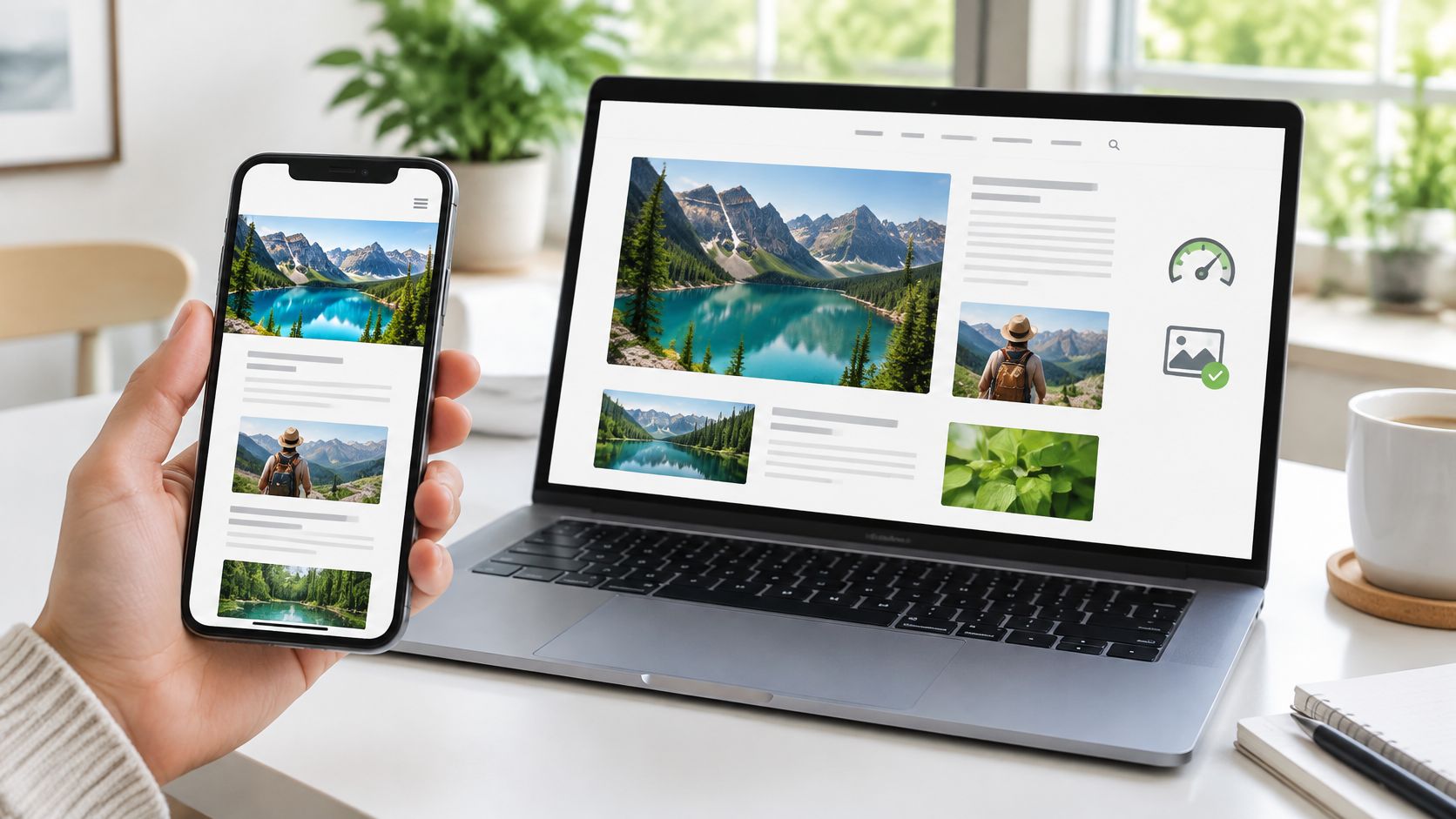
You open your WordPress blog on your phone during a slow commute. The homepage looks fine, but a post's comparison table runs off the screen, the menu won't close, and a signup banner covers the paragraph you're trying to read. Your readers won't stay to diagnose the problem.
Learning how to make a WordPress blog mobile friendly starts with fixing what blocks reading, not polishing colors. Work in order: repair the layout, make controls usable, reduce loading work, then confirm the results on actual phones. A beautiful desktop preview doesn't prove that your post template works on a narrow screen.
Mobile-Friendly Requirements Your Blog Must Meet
Test individual pages, not just the homepage. In its mobile-friendly update announcement, Google explained that on April 21, 2015, it began expanding mobile-friendliness as a ranking signal for mobile searches in every language and location, assessed page by page.
That distinction matters in WordPress. Your homepage, single posts, archives, and search results can use different templates. A responsive homepage doesn't protect a post containing an oversized table or an old video embed.
Mobile-friendly requirements and how to check them
Google's practical criteria were readable text, separated tap targets, no horizontal page scrolling, and playable content. The viewport check below helps establish the foundation for meeting them.
| Requirement | What It Looks Like on a WordPress Blog | How to Check It |
|---|---|---|
| Readable text without zooming | Body text at 16 px or larger as a practical starting point | Load a post on a phone and read it without pinching |
| Tap targets spaced apart | Menu links, buttons and pagination with room between them | Tap each control with a thumb and watch for misfires |
| No horizontal scrolling | Tables, images and embeds fit the screen width | Swipe sideways on a long post and a category archive |
| Viewport configured | Meta viewport tag present in the page head | View page source and search for the viewport tag |
| No unplayable content | No embeds, videos or plugin elements that fail in mobile browsers | Open each embedded element in a phone browser |
A wide table may need its own scrollable wrapper, but it shouldn't make the whole page slide sideways. Readers should always be able to continue down the article without repositioning the page.
Practical rule: If someone has to zoom, hunt for a close button, or repeatedly tap a link, fix that before adjusting decorative styling.
The historical update affected mobile results, not desktop or tablet searches. Google also made clear that strong, relevant content could still rank despite weak mobile usability. These repairs support good writing; they don't replace it.
How to Set Up a Responsive Theme and Viewport
A plugin can't reliably repair a theme whose layout never adapts. Start on a staging copy or take a restorable backup, especially if changing themes could affect menus, widgets, or page-builder content.
Check the foundation before changing the design
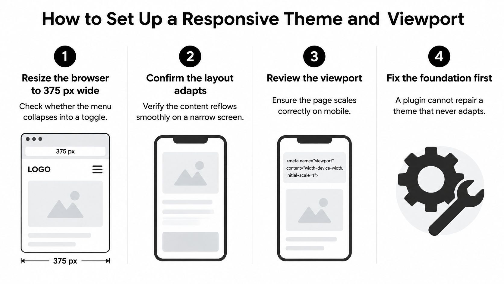
Narrow the browser. Use your browser's responsive mode, for example at 375 px wide, and watch whether the menu becomes a toggle and the sidebar moves below the article. The important result is readable content without a desktop-width canvas squeezed onto a phone.
Inspect the viewport. Open a single post's page source and search for
name="viewport"; its content should includewidth=device-width, initial-scale=1. If it's missing, correct the theme's header output rather than adding competing viewport tags through several plugins.Evaluate a replacement when the foundation fails. Choose a maintained responsive theme, inspect its update history, and open its demo on a real phone. A restrained theme is usually easier to maintain than a feature-heavy demo whose animations and bundled components you won't use.
Protect template changes. Make file-level template edits in a child theme so parent-theme updates don't overwrite them. Keep a record of custom CSS and distinguish those changes from settings saved through the Site Editor.
Preview more than the front page. Open a long post, a category archive, and search results. Look for fixed-width containers, wide code blocks, and image alignment rules that affect only particular templates.
Use this visual checklist while checking the theme.
Choose maintainability over a polished demo
Don't replace a healthy theme just because a custom CSS rule broke the post wrapper. Inspect the offending element first. Removing a fixed width or correcting a grid's minimum sizing can be less disruptive than rebuilding the site.
If you're comparing no-cost options, use the guide to getting premium WordPress themes for free while checking licensing, legitimate distribution, and update access. A theme you can't safely update is a poor foundation.
Finally, compare the block editor's content width with the published page. Wide and full-width blocks need front-end testing; the editor preview isn't a guarantee that the theme renders them correctly.
How to Fix Menus, Buttons and Layout Breaks
A menu can look tidy on desktop and still fail on a 375 px phone screen: labels wrap awkwardly, a submenu covers the close control, or buttons sit too close together. Fix these phone interactions before polishing colors or spacing.
Make navigation usable with a thumb
Open the menu on a phone. Tap every link and submenu, then check that the close control stays reachable. A desktop mouse won't reveal whether menu items are difficult to tap.
Give controls room. Aim for 44 by 44 CSS pixels where practical. WCAG's enhanced target-size criterion, 2.5.5, specifies that size; the AA criterion, 2.5.8, specifies 24 by 24 CSS pixels, subject to exceptions.
Use tap-to-open dropdowns. Phones don't provide a dependable equivalent of hovering. Make the parent link and submenu behavior clear so readers can open a submenu without unexpectedly leaving the page.
Label search and icon controls. Give search fields visible labels or accessible names, and give icon buttons meaningful names. Keep useful search, comments, and RSS controls available rather than removing them just to simplify the header.
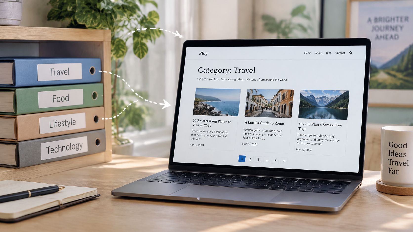
Stress-test the menu with a long category name and a nested submenu. For example, add “WordPress post category page layouts” as a category label, then place a child link beneath it. On a phone, confirm that the label wraps cleanly, the child link is easy to tap, and the menu can still be closed. The WordPress post category page guide can help when adjusting archive layouts where titles, thumbnails, and pagination compete for space.
Repair overflow without hiding content
Contain wide elements. Put tables and code blocks in horizontally scrollable containers, while keeping the article wrapper within the viewport. Set embedded media to a maximum width of 100 percent and preserve its aspect ratio.
Keep body text readable. Start at 16 px or larger, then judge the rendered text on a phone. Check long headings, linked URLs, captions, and lists as well as ordinary paragraphs.
Keep signup prompts easy to dismiss. A full-screen overlay with a tiny close button blocks the article, even when the page underneath responds to the screen size.
Shrinking a desktop layout isn't the same as making its content reflow.
Shrink Images, Page Weight and Plugins
An oversized featured image can delay the article's most prominent visible element. In HTTP Archive's 2024 media analysis, the median mobile page's largest image was about 135 KB, compared with approximately 404 KB at the 75th percentile and 1,002 KB at the 90th percentile.
Those are distribution references, not mandatory image budgets. They're useful for spotting an image that deserves investigation before you spend time minifying a small stylesheet.
The image workflow should produce smaller downloads without visibly damaging the article's illustrations.
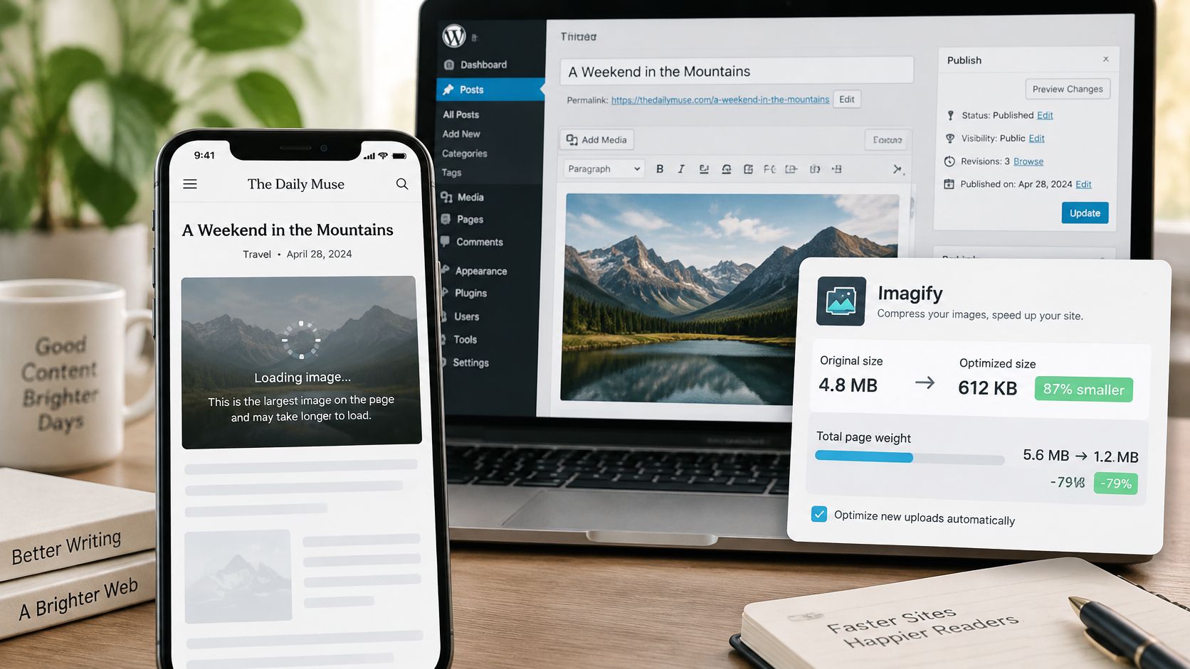
Image size references for mobile posts
| Image Type | Reference Size | Format | Action |
|---|---|---|---|
| Typical largest mobile image | About 135 KB, median | WebP with srcset variants | Serve phone-sized files |
| Upper-quartile image | About 404 KB, 75th percentile | WebP or AVIF | Resize and compress before upload |
| Oversized outlier | About 1,002 KB, 90th percentile | Re-export as WebP or AVIF after resizing | Check for a desktop-sized hero and scale it down |
| Inline body photo | Under 200 KB at display width, a working guideline rather than a measured threshold | WebP or JPEG | Lazy load and set width and height |
Optimize the delivered file, not just the upload. A compressed original still wastes bandwidth if the phone receives desktop dimensions. Inspect the image request in browser developer tools to see which file downloads.
Work through the image pipeline in this order:
- Resize the source to the largest display size your design needs, while allowing an appropriate higher-density variant.
- Generate WebP or AVIF versions with a single image workflow. Check screenshots and diagrams carefully because aggressive compression can blur text.
- Verify responsive delivery. WordPress should output useful
srcsetcandidates and an accuratesizesattribute; theme components and CSS backgrounds need separate inspection. - Set explicit width and height attributes, or a suitable CSS aspect ratio, so the browser can reserve space.
- Exclude the primary hero from lazy loading. Lazy-load below-the-fold images instead, and preload the hero only when testing confirms it's the actual LCP element.
For manual preparation, GIMP is a concrete option among free tools like Photoshop: the Pixpa Photoshop alternatives comparison identifies it as a free, open-source raster editor for Windows, macOS, and Linux. Use it for resizing and editing, then let a consistent WordPress workflow handle delivery.
When publishing, follow a repeatable process for creating posts in WordPress so captions, image sizes, and featured images don't require emergency repairs afterward.
Reduce the whole page, not just photographs
HTTP Archive's 2025 page-weight analysis puts the median mobile homepage around 2.6 MB and reports that only 53% of mobile pages weighing 2–3 MB passed Core Web Vitals, compared with 63% of desktop pages in that range. Its separate 2025 CMS analysis reports an average mobile page weight of approximately 2.28 MB, a different measure from the homepage median.
Page weight isn't a pass-or-fail switch, but it's a useful reason to question unnecessary components. Remove homepage sliders, unused font weights, abandoned widget scripts, and third-party embeds that don't help the reader.
For a visual walkthrough of the optimization process, use the video below.
Keep responsibilities clear in the plugin stack:
- Caching: Use a host-compatible solution such as WP Rocket or LiteSpeed Cache, accounting for caching already supplied by your host.
- Images: Choose an optimizer such as ShortPixel, Smush, or Imagify, and verify which conversion and resizing features your chosen configuration supports.
- Scripts: Assign deferral and minification to a single system. Overlapping settings make failures harder to isolate.
Optimization trade-off: Delaying every script may improve a test score while leaving the menu or search unusable. A broken control isn't a performance improvement.
After each configuration change, test navigation, search, and the comment form while logged out. Plugin count alone isn't the diagnosis; the work each plugin adds is what matters.
Test Real Phones and Confirm Each Fix
A successful desktop Lighthouse run doesn't establish mobile usability. Test mobile loading, reading, and interaction separately, then confirm that real visitors benefit rather than relying on a single favorable lab result.
According to HTTP Archive's 2025 SEO analysis, 48% of mobile web pages achieved a good overall Core Web Vitals experience. Passing is worth pursuing, but it isn't a ranking guarantee or a substitute for useful content.
Core Web Vitals targets for mobile
Google's Search Console Core Web Vitals documentation describes field assessment over 28 days, using the 75th percentile of experiences; the good targets are LCP at 2.5 seconds or less, INP at 200 milliseconds or less, and CLS at 0.1 or less.
| Metric | Good Threshold | Common Cause on Blogs | Usual Fix |
|---|---|---|---|
| Largest Contentful Paint | 2.5 seconds or less | Oversized hero image or slow server response | Compress and selectively preload the hero image, improve caching |
| Interaction to Next Paint | 200 milliseconds or less | Heavy JavaScript from plugins or ad scripts | Defer noncritical scripts and remove unused plugin functionality |
| Cumulative Layout Shift | 0.1 or less | Images, embeds or banners without reserved space | Set dimensions and reserve ad slots |
These are diagnostic starting points, not guaranteed explanations. Inspect which element loads late, which interaction stalls, or which component moves before choosing a fix.
Use the testing flow below to connect immediate checks with longer-term field results.
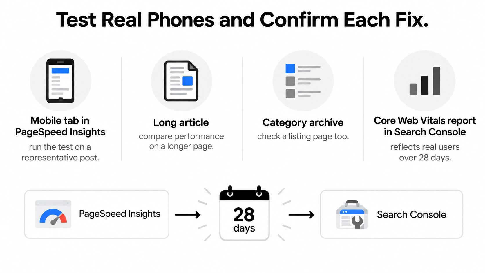
Keep a small testing log
- Choose representative templates. Test the homepage, a long post, and an archive using the mobile tab in PageSpeed Insights. Add search results when they use a distinct layout.
- Record the failing metric and the suspected element. Separate field results from the lab diagnostics.
- Match the intervention to the symptom. A late hero needs different treatment from a menu that freezes after tapping.
- Change one thing, clear the relevant caches, and retest. Record the change so you can reverse it if functionality deteriorates.
- Verify on a mid-range Android phone over mobile data. Read the post, open navigation, submit a search, and inspect banners rather than merely watching the first screen load.
Search Console may lack field data for lightly visited pages, so an absent report isn't proof of success. Use lab diagnostics and hands-on testing while field evidence accumulates.
Retest quarterly and after theme, advertising, or major plugin changes. Fix one representative post, confirm that its measurements and usability improve, then apply the repair across the relevant templates.
Read More Information publishes practical guides on WordPress themes, scheduled posts, blog layouts, and site setup, alongside articles on RSS, site search, responsive design, and web basics. Visit Read More Info to choose your next WordPress improvement, then test it on the same phone-sized post you've just repaired.